Standalone Elements
Individual open source web components with zero or few dependencies.

<ax-comments>
A web component with minimal set of dependencies for implementing an out-of-the-box commenting solution.

<chess-board>
A chess board custom element that works anywhere HTML works. Fork of the wonderful chessboard.js library.
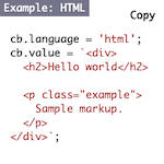
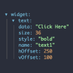
<code-block>
Code block custom element with syntax highlighting and copy button, powered by highlight.js library.

<css-doodle>
A web component for drawing patterns with CSS. It generates a grid of divs by the rules (plain CSS) inside it.
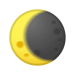
<dark-mode-toggle>
A custom element that allows you to easily put a Dark Mode 🌒 toggle or switch on your site.
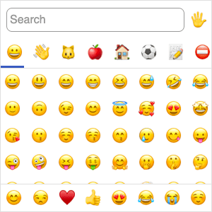
<emoji-picker>
A lightweight emoji picker, distributed as a web component. Supports Emoji v14.0 and custom emoji.
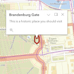
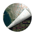
<esri-map-view>
Custom HTML component to place a map on any web page, powered by the ArcGIS API for JavaScript.

<file-drop>
A custom element that accepts File objects being dropped on it and fires an event when a successful drop occurs.

<filter-container>
A zero-dependency web component to filter visible child elements based on form field values.

gauge.webcomponent
A collection of a few gauge libraries, converted to web components.

<image-compare>
A zero-dependency web component for comparing two images using a slider.

Image Display Control
A custom <img> element that responsively displays the best fitting image region.

<input-knob>
A rotating, touch-sensitive knob web component that you can use like an <input type="range">.

<is-land>
A new performance-focused way to add interactive client-side components to your web site.
<json-viewer>
Web Component to visualize JSON data in a tree view, built with Lit library.

<lite-youtube-embed>
A custom element that provide videos with a supercharged focus on visual performance.
<mapml-viewer>
Prototype implementation of the <map> media element defined in the MapML specification.

<math-field>
A web component for easy math input: works just like <textarea>, but for math.

<md-block>
A web component to render stylable Markdown in your HTML. Uses marked under the hood.

<miller-columns>
Miller columns (cascading lists) web component for hierarchical topic selection on GOV.UK.

<model-viewer>
A web component to display interactive 3D models on the web & in AR.

<o-embed>
Web component to automatically switch out tags with oEmbed-compatible social websites. Build with Lit library.

Playerx
Media player web component with uniform API across platforms.

<progressive-image>
Web Component for progressively enhancing image placeholders once they are in the viewport.
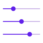
<range-slider>
Accessible range slider custom element with keyboard support. Follows the ARIA best practices guide on sliders.

<rapi-doc>
Custom Element for Open-API spec viewing, built with Lit library.

Svelecte
Selectize-like component written in Svelte, usable as custom element.

Swiper Element
Swiper web components are available since Swiper version 9.
tab.webcomponent
A simple tab-control web component.

<theme-switch>
An animated custom HTML element which toggles between light theme, dark theme, and OS theme.

Trix
A rich text editor custom element for everyday writing. An open-source project from Basecamp.
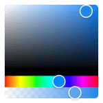
Vanilla Colorful
A tiny color picker web component for modern web apps (2.7 KB). Port of React Colorful to vanilla Custom Elements.

Vime
A customizable, extensible, accessible and framework agnostic media player.

<zero-md>
A web component to load and display an external MD file. Uses Marked and Prism libraries under the hood.